Utah Office Wall Art
Utah Office Wall Art
Utah Office Wall Art works best when it feels inevitable. Not added. Not staged. It's just part of the space, as if it always knew it belonged there.
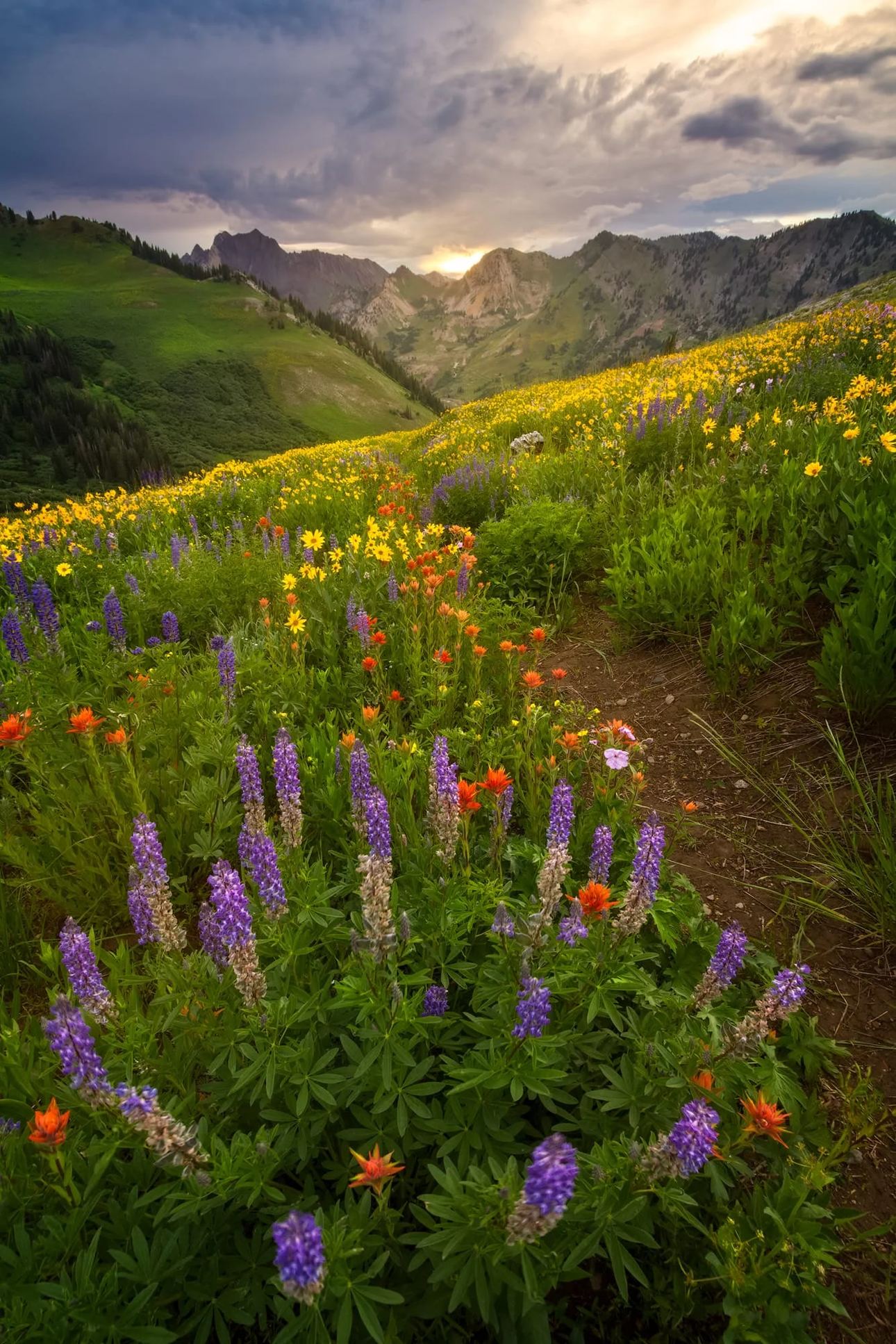
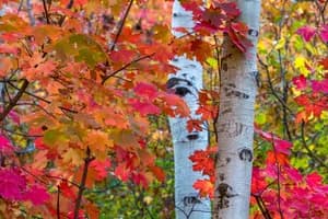
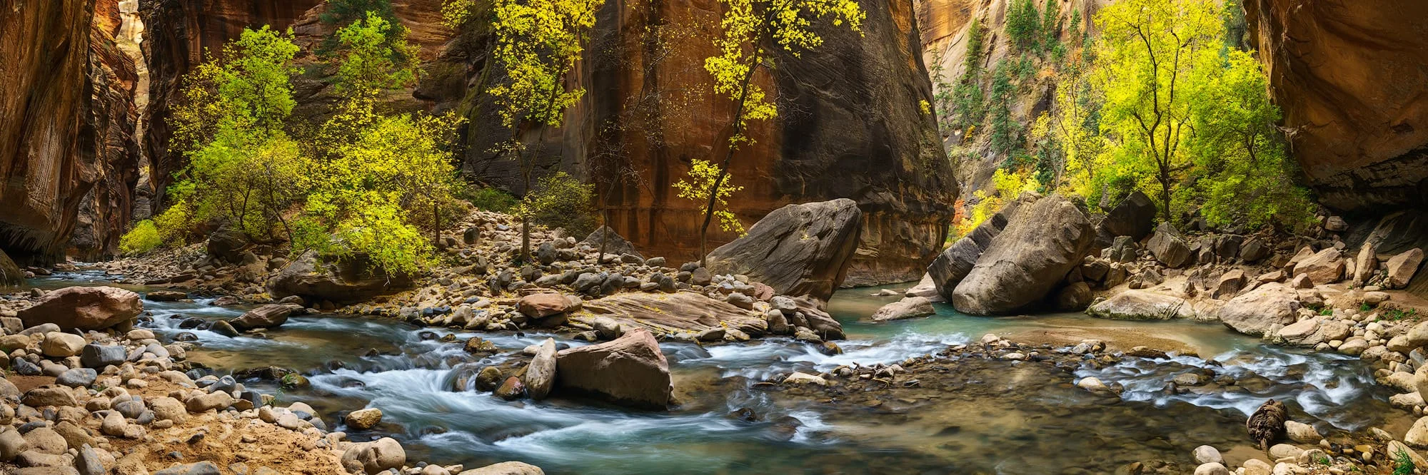
That's what separates Utah landscapes from more conventional or generic wall art you pick up at the local Hobby Lobby. They don't depend on complexity or visual noise. A ridge line in winter light. A desert basin in the early morning. The Wasatch catching late afternoon shadow. These scenes don't compete for attention. They hold it.
Why Utah Office Wall Art Belongs in Serious Workspaces
Most office walls are filled as an afterthought. Something neutral. Something safe. Something that offends no one and ultimately says nothing. They can be boring to say the least.
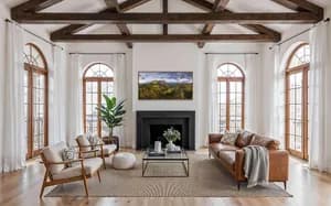
But professional spaces, especially client-facing ones, don't benefit from neutral. They benefit from intention. Adding a custom piece of artwork not only creates a calm space for you to enjoy but also draws others in to that same sense of peace.
Utah landscape art carries that intention naturally. It has structure, scale, and a sense of place that people recognize even if they've never stood there. That recognition matters in business environments where first impressions carry real weight.
There is also a quieter effect at work. Strong landscapes slow a room down. Not in a way that distracts, but in a way that steadies attention. That's where biophilic design stops being theoretical and starts being practical.
Utah Landscape Art and the Language of Professional Interiors
Good office design doesn't try to impress through accumulation. It communicates through restraint. That's where Utah photography prints outperform generic decor.
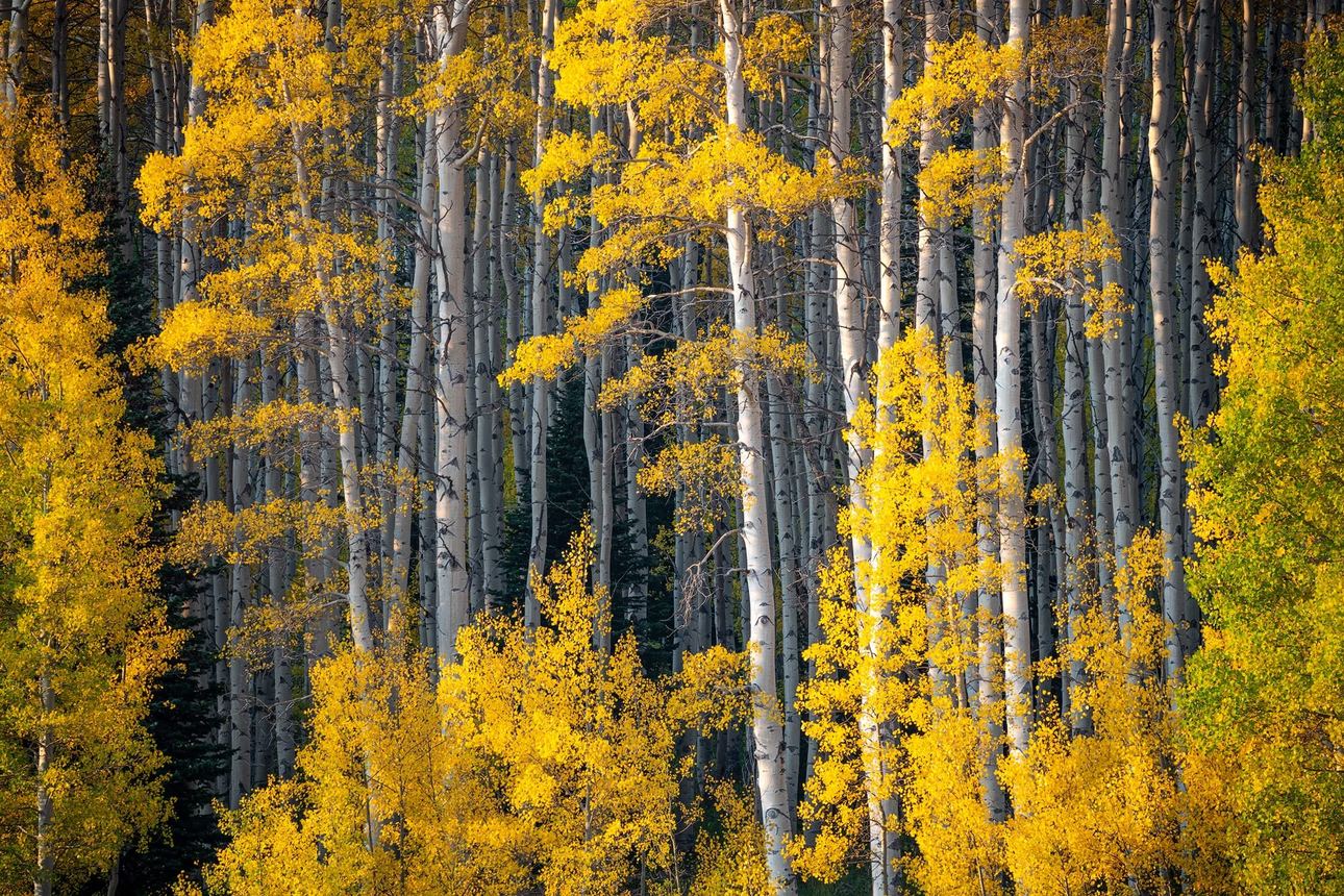
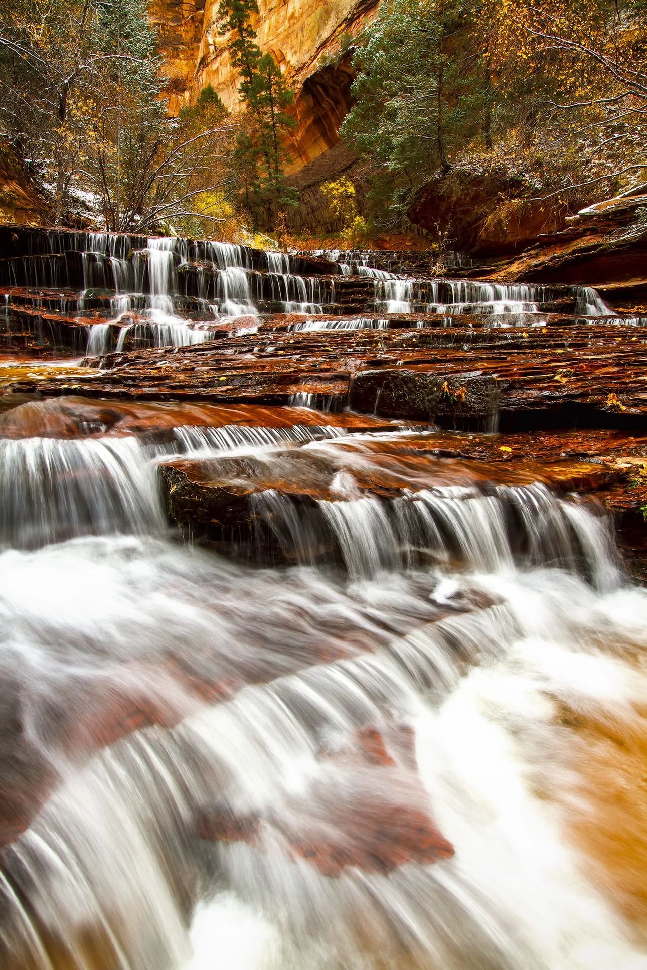
They carry geographic identity without announcing it. You're not looking at abstract texture or placeholder imagery. You're looking at real terrain. Real weather. Real elevation. That specificity reads in a room even when no one can name it.
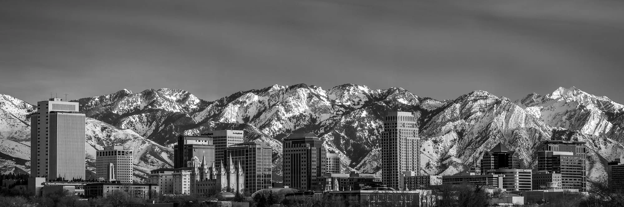
The Wasatch Range sets the tone
The Wasatch Front has a particular kind of presence. Steep, direct, and unmistakably structured. Peaks like Mount Timpanogos aren't simply scenic subjects. They function as natural anchors in a room.
Placed in a conference space or reception area, they do something subtle but consequential. They create orientation. A visual point of gravity that the rest of the room organizes around without effort.
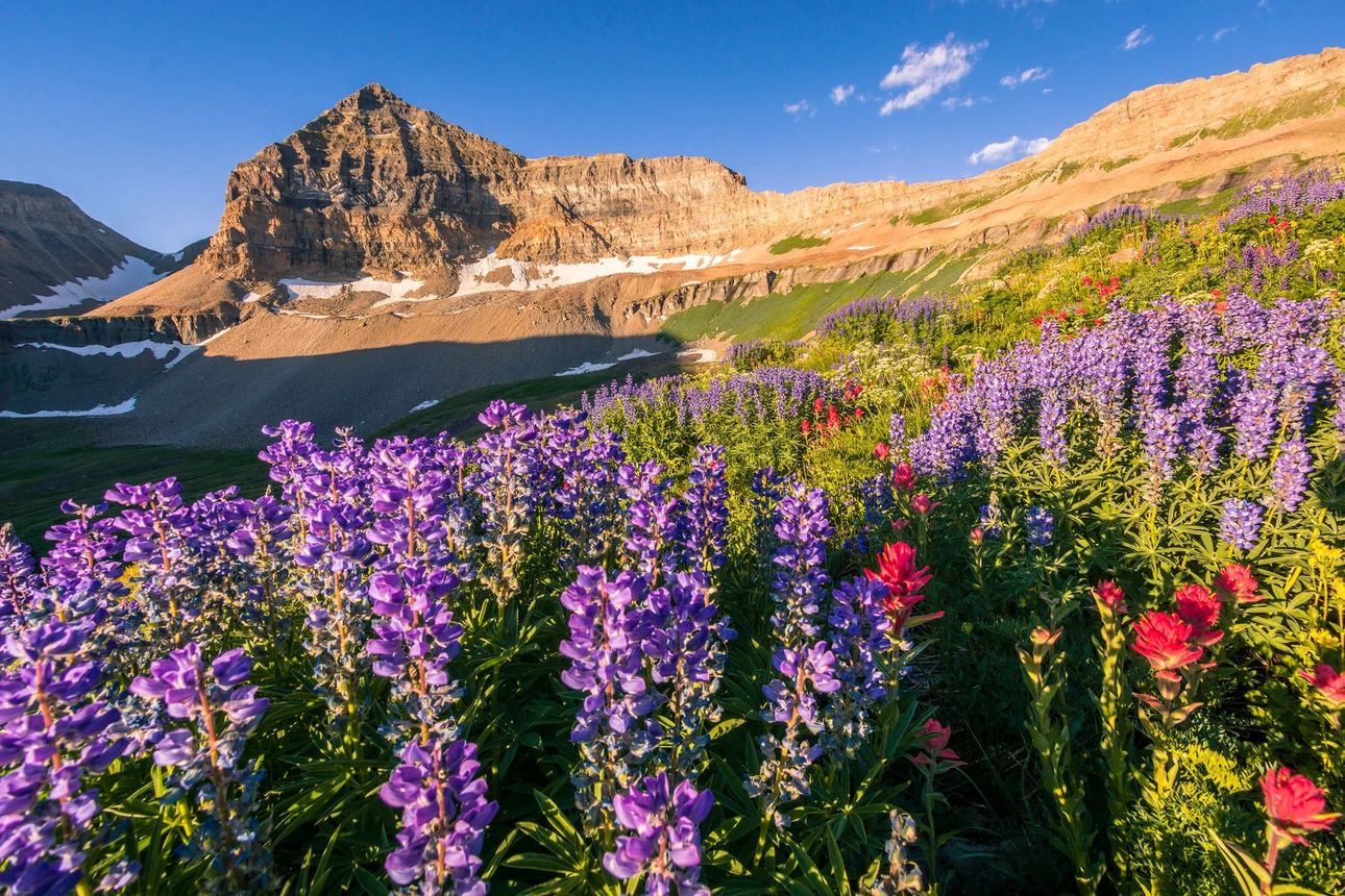
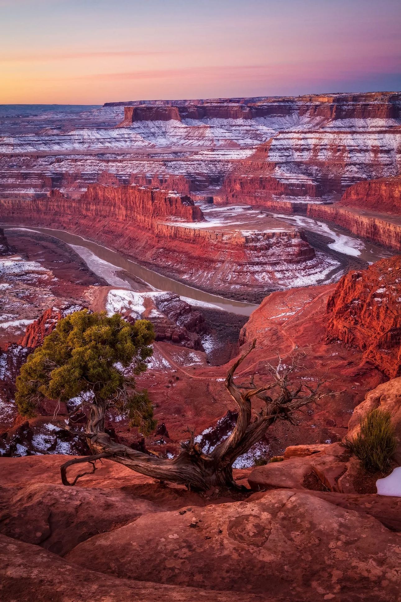
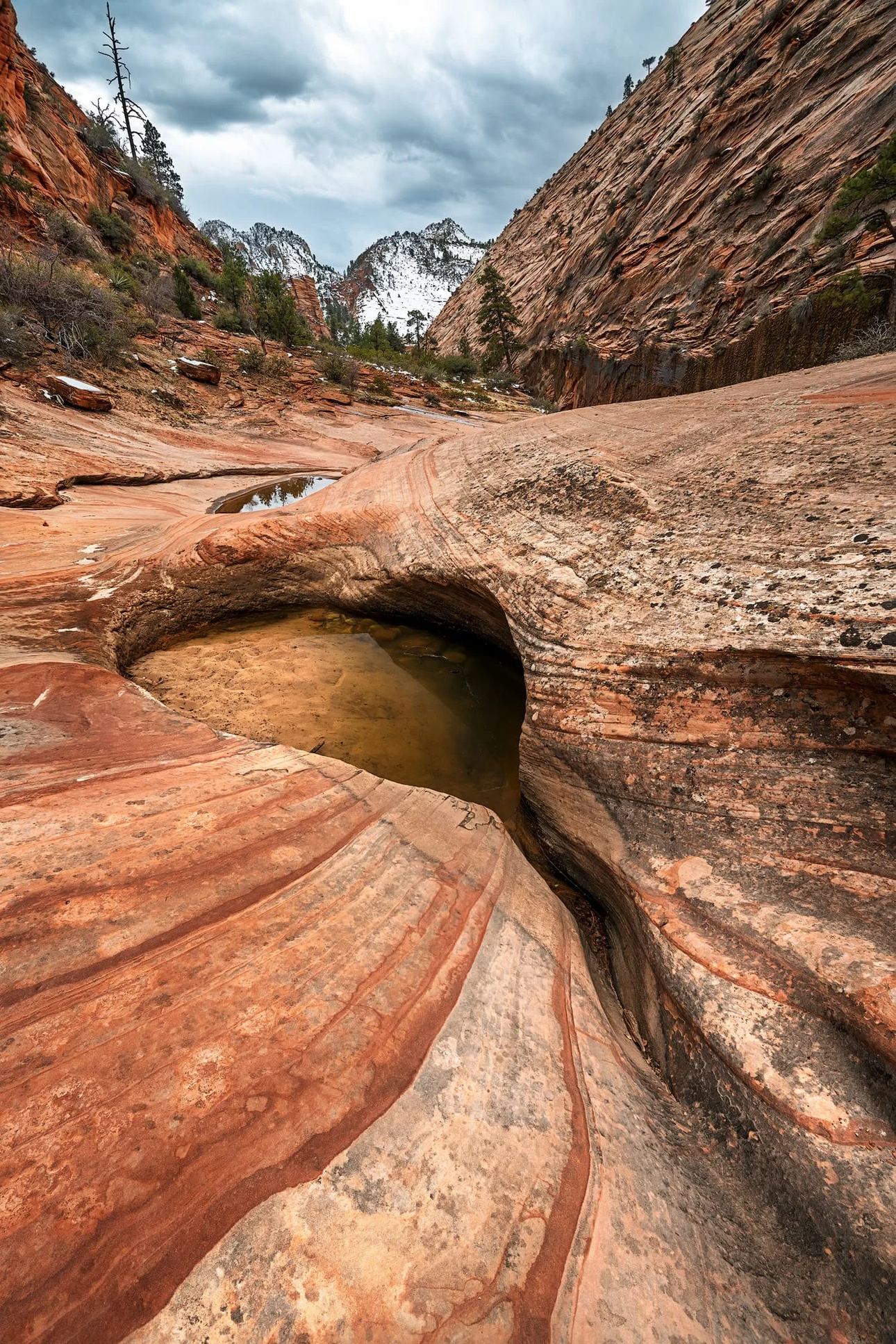
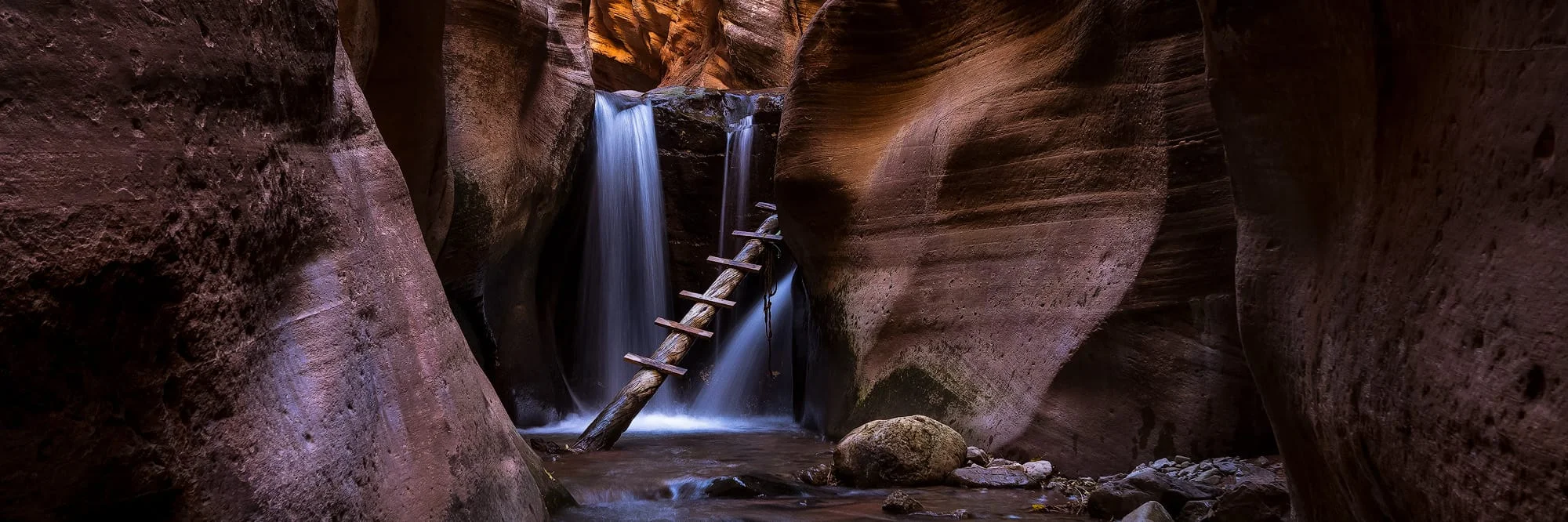
Desert landscapes add contrast without chaos
Southern Utah shifts the tone entirely. The slickrock sandstone formations, open desert basins, and long shadow transitions introduce negative space in a way that feels considered rather than accidental.
For interiors, that balance is harder to achieve than it appears. Too much visual density creates fatigue. Too little feels unfinished. Utah sits precisely in the middle.
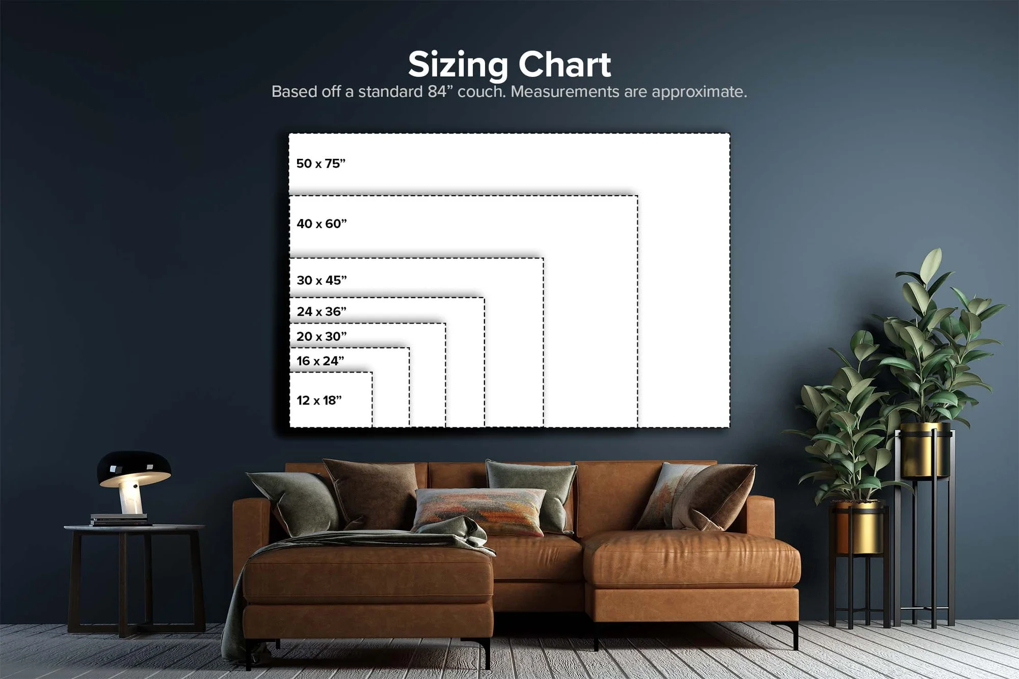
Office landscape art built for scale, not decoration
There is a meaningful difference between wall art that looks strong online and wall art that survives scale.
Most imagery falls apart when it grows large. Soft edges become obvious. Noise surfaces. Contrast breaks down under office lighting conditions that were never considered during production.
This work is built differently. Every photograph is captured with large-format reproduction in mind from the start. Not adapted later.
Reception spaces that need immediate visual authority
Conference rooms that benefit from wide horizontal structure
Executive offices that require controlled, calm visual focus
Hospitality and healthcare interiors where tone matters as much as subject
Scale is not just size. It's clarity maintained at size.
Materials that change how professional wall decor behaves in light
Lighting is where most office art decisions quietly fail. Bright windows. Mixed LEDs. Harsh overhead fixtures. Each one changes how a print performs in ways that aren't obvious until installation.
HD Acrylic face mounts
Acrylic changes perception. It adds depth without making the image feel artificial. Mountain ridges read as layered rather than flat. Snowfields carry a subtle internal luminosity that shifts with the light in the room.
In spaces with controlled lighting, it creates presence without competing for attention.
ChromaLuxe metal prints
Metal behaves differently. Clean edges. Controlled reflection. No visual clutter under strong or directional lighting.
It works especially well in modern offices where precision matters more than softness, and where the architecture already does most of the work.
Museum-grade consistency at scale
Both materials are chosen for the same reason. They hold detail when the image becomes large. Not just passable detail, but reliable, consistent detail across the entire surface.
What most offices get wrong about Utah office wall art
The most common mistake is assuming any mountain image will work. It won't. Context matters more than subject matter.
Generic imagery with no real geographic identity
Improper scaling that leaves rooms feeling visually unbalanced
Multiple competing pieces instead of a single focal point
Ignoring lighting conditions until after installation
Strong interiors are edited, not filled.
Why this approach to Utah landscape art is different
These photographs are captured with large-format output in mind from the beginning. Not adapted afterward. That changes everything about composition, detail, and tonal control across the full surface of the print.
At scale, small compromises become obvious. That's why every image is evaluated by how it performs at 80 inches or larger, not how it reads on a screen.
The result is work that remains consistent when it becomes part of architecture rather than something placed in front of it.
If you are exploring related work, see Utah Landscape Photography Prints or learn more about How Fine Art Nature Photography Transforms Your Home.
FAQ: Utah Office Wall Art
Why does Utah work so well for office interiors?
Utah landscapes combine structure, clarity, and natural scale in proportions that are genuinely uncommon. That combination supports focus and reduces visual noise in professional environments without feeling sparse.
What size works best for office installations?
Larger formats typically perform better in professional settings. A single dominant piece tends to create more presence and impact than several smaller works competing for the same wall.
Should I choose acrylic or metal prints?
Acrylic adds depth and richness. Metal prioritizes clarity and glare control. The right choice depends on your lighting conditions and the overall design intent of the space.
Can artwork be tailored to specific office layouts?
Yes. Scale, orientation, and finish can all be matched to the space, the wall dimensions, and the lighting conditions present before installation.
Bring Utah Office Wall Art into a space that needs presence
Utah Office Wall Art is not about filling space. It's about defining it.
If the goal is a professional environment that communicates clarity and intention, the artwork has to support that standard. Not merely occupy the wall beside it.
Contact me for a free visual mockup to see how large-format Utah landscape photography changes the character of an interior before anything is committed.